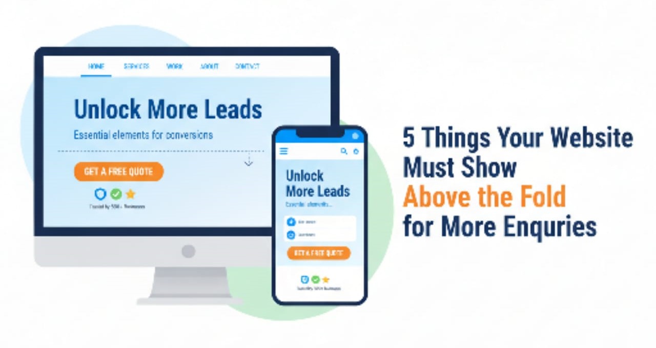
Visitors decide in seconds whether to stay on your site or click away, and most of that decision happens above the fold – the part of the page they see before scrolling. If this visible area is unclear or cluttered, you will lose leads no matter how good the rest of your site is.
1. A clear, benefit‑driven headline
The first thing visitors should see is a simple headline that explains what you do and how it helps them, not vague marketing jargon. Strong hero headlines answer “What’s in it for me?” in plain language and set the tone for the rest of the page.
What to do:
State your main value proposition clearly, e.g. “Conversion‑focused web design that brings you more enquiries.”
Avoid buzzwords; make it obvious who you help and what outcome you deliver.
Include a relevant keyword naturally for both visitors and search engines.
A sharp headline makes visitors feel “I’m in the right place” and keeps them reading instead of bouncing.
2. A short sub‑headline that adds context
Right under your headline, a brief sub‑headline should give a little more detail or emotion without turning into a full paragraph. This line helps clarify your offer, niche or location, and connects with the visitor’s pain or desired outcome.
Best practices:
Expand on the promise in one short sentence, e.g. “We design fast, mobile‑first websites that turn your Lagos visitors into real leads.”
Mention your target audience (SMEs, service businesses, e‑commerce stores, etc.) and/or city where relevant.
Keep it concise and easy to scan; no long blocks of text above the fold.
Together, the headline and sub‑headline form a mini‑pitch that answers who you are, what you do and why it matters – without scrolling.
3. A strong primary call‑to‑action (CTA)
Visitors need a clear next step, not guesswork. A prominent primary CTA above the fold makes it easy for them to contact you, request a quote or book a call. Studies show that clearly visible CTAs near the top of the page often have higher interaction rates than those hidden further down.
Make your CTA:
Specific and action‑oriented, e.g. “Request a Free Website Audit”, “Book a 15‑Minute Strategy Call”, “Get a Quote Today”.
Visually prominent, using a contrasting button colour and adequate white space.
Repeated further down the page so visitors can act whenever they are ready.
A clear CTA above the fold channels attention and turns casual visitors into actual enquiries.
4. Visual proof or trust signals
People decide whether to trust you in milliseconds, and visuals play a big role in that decision. Above the fold, your design should include at least one visual element – such as a hero image or illustration – plus quick trust signals that reduce risk. Trust elements visible without scrolling have been shown to increase user confidence and conversions.
Examples of trust signals above the fold:
A high‑quality image or illustration that reflects your service or ideal client, not random stock photos.
Client logos, review stars, brief testimonial snippets or “Trusted by 50+ Nigerian SMEs” text.
Security badges or guarantees (for e‑commerce and forms), like “Secure checkout” or “14‑day money‑back guarantee.”
These visual cues help visitors feel safer about contacting you or sharing their details.
5. Simple navigation and easy contact options
Lastly, the top of your page should make it effortless to find important pages and contact you quickly. A cluttered menu or hidden contact details can cost you many enquiries.
Above‑the‑fold usability essentials:
Clean navigation with a small number of clearly labelled items (e.g. Home, Services, Portfolio, About, Blog, Contact).
Visible contact options such as a “Contact” link, phone number, or a clear “Enquire Now” button in the header.
On mobile, a well‑designed menu icon plus a persistent CTA or contact button that is easy to tap.
When visitors instantly know how to reach you and where to go next, they are much more likely to turn interest into an actual enquiry.
Your above‑the‑fold section is the most valuable space on your website. When it clearly shows the right message, trust signals and a strong call‑to‑action, you turn more visitors into real enquiries without needing extra traffic. If you want help redesigning your hero section for maximum impact, De-Faith Concept specialises in conversion‑focused web design that brings you more leads. Click here to request a free homepage audit and get clear recommendations tailored to your business.
